Color
Content

Introduction
Color is a fundamental building block of Student Perks’ visual identity. It defines the look and feel of the interface, reinforces meaning, and creates hierarchy, ensuring the platform is both visually appealing and easy to navigate.
Principles
These principles form the foundation of the color system. They define the values that guide every decision, ensuring the system remains clear, consistent, and easy to apply across all contexts.
Palette
Lorem ipsum dolor sit amet, consetetur sadipscing elitr, sed diam nonumy eirmod tempor invidunt ut labore et dolore magna aliquyam erat, sed diam voluptua. At vero eos et accusam et justo duo dolores et ea rebum. Stet clita kasd gubergren, no sea takimata sanctus est Lorem ipsum dolor sit amet.
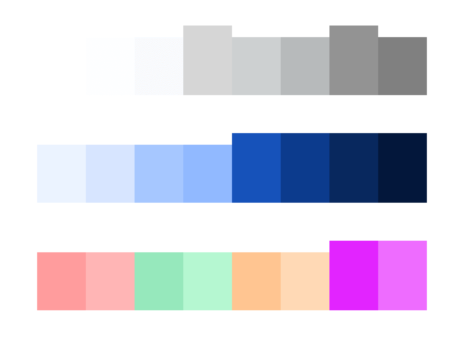
Neutral
Neutral colors are used for most backgrounds, text, and shapes in the platform. They usually don’t carry a specific meaning but can indicate states like disabled elements.
neutral.200
Use neutral.200 for headings, interactive text buttons, highlighted body text, and active icons.
neutral.100
neutral.100 is strictly used for body text & paragraphs = large amounts of text.
neutral.75
neutral.75 is strictly used for empty state text and placeholders, such as within input fields.
neutral.50
neutral.50 is strictly used only for outlines around objects, mostly in combination with neutral.25.
neutral.25
Neutral.25 is the secondary background and is mainly used to highlight certain objects, such as cards.
neutral.0
neutral.0 is only being used as the primary background for the entire platform.
Primary
Primary colors don’t communicate a specific meaning to users. They are strictly used to represent the Student Perks branding and to highlight certain elements, such as interactive components.
primary.100
Primary.100 is the main brand color. It is strictly used for primary buttons, icon highlights, and featured section backgrounds.
primary.75
Primary.75 is mainly used for primary button outlines.
primary.50
Hier noch ausarbeiten
primary.25
Hier noch ausarbeiten
Misc
Misc colors (miscellaneous) communicate specific meanings to users. They indicate states such as success or error, or draw attention to important elements.
color.misc.error.100
Used for displaying error messages or indicating locked states.
color.misc.error.50
Used as a supporting color to color.misc.error.100 for subtle backgrounds.
color.misc.success.100
Used for displaying success messages or indicating something new.
color.misc.success.50
Used as a supporting color to color.misc.success.100 for subtle backgrounds.
color.misc.attention.100
Used for drawing attention to certain objects, messages, or indicating something important.
color.misc.attention.50
Used as a supporting color to color.misc.attention.100 for subtle backgrounds.
Usage
For guidance on using color to represent the Student Perks brand identity, refer to the Brand Assets page. For color usage in specific components, see the Components Detail pages.
Do not create or add new colors, and never change existing hex values; this preserves the integrity of the Student Perks visual identity.
Always stick to the defined color palette to ensure consistency across the interface and maintain the intended meaning of each color.