Token Library
Content
Introduction
Design tokens are the single source of truth for naming and storing design decisions, ensuring consistency and efficiency across all products and platforms.
Naming Conventions
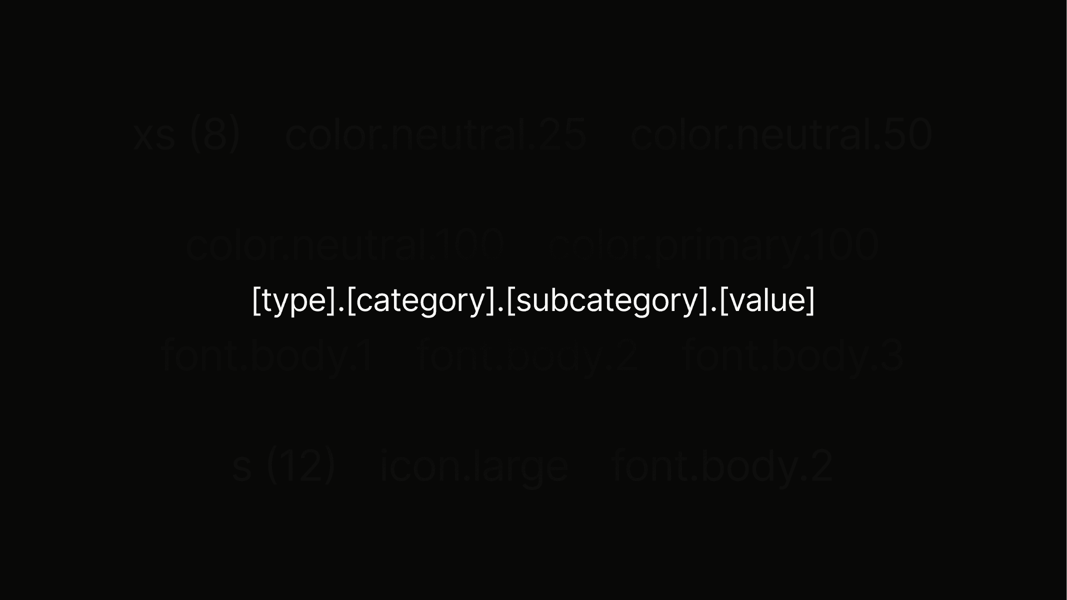
The tokens follow a clear and consistent pattern, making them easy to use, understand, and apply across all design elements.
Color
For more information about color please visit the detail page.
Token
color.neutral.200
Value
#000000
Description
Used for headings, interactive text buttons, highlighted body text, and active icons.
Preview
Token
color.neutral.100
Value
#707578
Description
Strictly used for body text & paragraphs = large amounts of text.
Preview
Token
color.neutral.75
Value
#9BA1A4
Description
Strictly used for empty state text and placeholders, such as within input fields.
Preview
Token
color.neutral.50
Value
#F2F2F2
Description
Strictly used only for outlines around objects, mostly in combination with neutral.25.
Preview
Token
color.neutral.25
Value
#FAFAFA
Description
Used as the secondary background and is mainly used to highlight certain objects, such as cards.
Preview
Token
color.neutral.0
Value
#FFFFFF
Description
Only being used as the primary background for the entire platform.
Preview
Token
color.primary.100
Value
#2474FF
Description
Main brand color. It is strictly used for primary buttons, icon highlights, and featured section backgrounds.
Preview
Token
color.primary.75
Value
#4D8EFF
Description
Only being used as the primary background for the entire platform.
Preview
Token
color.primary.50
Value
#AECBFF
Description
Mainly used for primary button outlines.
Preview
Token
Value
#D6E7FF
Description
Only being used as the primary background for the entire platform.
Preview
Token
color.misc.error.100
Value
#FF3A3B
Description
Main brand color. It is strictly used for primary buttons, icon highlights, and featured section backgrounds.
Preview
Token
color.misc.error.50
Value
#FF6B6B
Description
Main brand color. It is strictly used for primary buttons, icon highlights, and featured section backgrounds.
Preview
Token
misc.success.100
Value
#2ED17A
Description
Main brand color. It is strictly used for primary buttons, icon highlights, and featured section backgrounds.
Preview
Token
misc.success.50
Value
#6BEFA4
Description
Main brand color. It is strictly used for primary buttons, icon highlights, and featured section backgrounds.
Preview
Token
misc.attention.100
Value
#FF8A24
Description
Main brand color. It is strictly used for primary buttons, icon highlights, and featured section backgrounds.
Preview
Token
misc.attention.50
Value
#FFB26C
Description
Main brand color. It is strictly used for primary buttons, icon highlights, and featured section backgrounds.
Preview
Typography
For more information about typography please visit the detail page.
Token
font.heading.1
Description
Used for main page titles and the strongest visual hierarchy.
Preview
Heading 1
Token
font.heading.2
Description
Used for section titles to structure content clearly.
Preview
Heading 2
Token
font.heading.3
Description
Used for sub-sections or highlighted content areas.
Preview
Heading 3
Token
font.heading.4
Description
Used for smaller headings within components or detail pages.
Preview
Heading 4
Token
font.heading.5
Description
Used for minor labels or supportive headings.
Preview
Heading 5
Token
font.body.3
Description
Used as the main text style and the basis for large elements such as button.l and badge.l.
Preview
Body 1
Token
font.body.2
Description
Used as a smaller text style for secondary content and the basis for medium elements such as button.m and badge.m.
Preview
Body 2
Token
font.body.3
Description
Used as the smallest text style for captions, fine print, and the basis for small elements such as button.s and badge.s.
Preview
Body 3
Spacing
For more information about spacing please visit the detail page.
Token
spacing.3xs
Value (px)
4
Description
Used for very tight spacing between small interface elements like icons or labels.
Preview
Token
spacing.2xs
Value (px)
6
Description
Used for short distances between related items like list entries or form fields.
Preview
Token
spacing.xs
Value (px)
8
Description
Used for inner top and bottom padding in smaller buttons, input fields and badges, as well as the gap between most headline-paragraph combination.
Preview
Token
spacing.s
Value (px)
12
Description
Used for short distances between related items, most commonly applied in buttons vertical padding.
Preview
Token
spacing.m
Value (px)
16
Description
Used for comfortable spacing in layouts, for example between cards or sections as well as container horizontal padding.
Preview
Token
spacing.l
Value (px)
32
Description
Used for creating clear separation in larger components or page structures.
Preview
Token
spacing.xl
Value (px)
64
Description
Used for generous spacing in grids or to highlight important content areas.
Preview
Token
spacing.2xl
Value (px)
96
Description
Used for structuring wide layouts and giving major sections enough breathing room.
Preview
Token
spacing.3xl
Value (px)
font.heading.1
Description
Used for large-scale compositions such as hero areas or oversized content blocks.
Preview
Token
spacing.4xl
Value (px)
112
Description
Used for maximum spacing in full-page layouts where strong visual hierarchy is needed.
Preview
Icons
Use the icon library to explore, browse icon tokens and easily download icons for Student Perks.