Typography
Content
Introduction
Lorem ipsum dolor sit amet, consetetur sadipscing elitr, sed diam nonumy eirmod tempor invidunt ut labore et dolore magna aliquyam erat, sed diam voluptua. At vero eos et accusam et
Principles
Follow these principles to ensure typography is clear and balanced. Combine them with Student Perks color and spacing tokens for consistent and easy-to-use designs.
Font
Student Perks uses Inter for all branding, including the platform itself. This ensures the UI is consistent, performs well, and feels seamless across different breakpoints.
Bold
Semibold
Semibold
Light
ABCDEFGHIJKLMNOPQRSTUVWXYZabcdefghijklmnopqrstuvwxyz0123456789 &→!
147
Supported languages
Styles
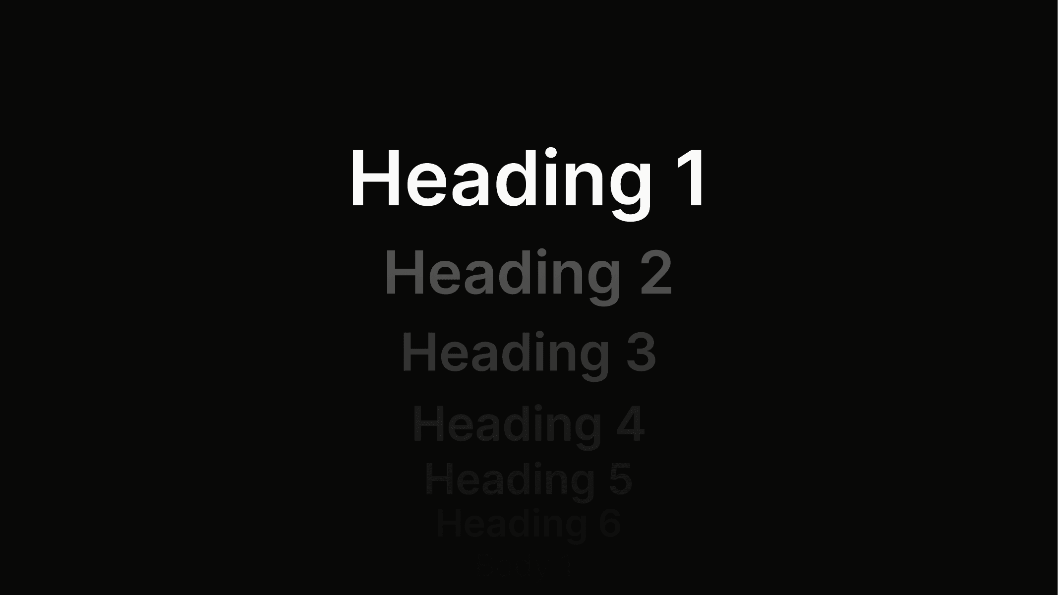
Heading 1
Used for main page titles and the strongest visual hierarchy.
Token
font.heading.1
Weight
Semibold
Color
color.neutral.800
Size
2.25 em
Line
1.2 Em
Heading 2
Used for section titles to structure content clearly.
Token
font.heading.1
Weight
Semibold
Color
color.neutral.800
Size
2.25 em
Line
1.2 Em
Heading 3
Used for sub-sections or highlighted content areas.
Token
font.heading.1
Weight
Semibold
Color
color.neutral.800
Size
2.25 em
Line
1.2 Em
Heading 4
Used for minor labels or supportive headings.
Token
font.heading.1
Weight
Semibold
Color
color.neutral.800
Size
2.25 em
Line
1.2 Em
Heading 5
Used for minor labels or supportive headings.
Token
font.heading.1
Weight
Semibold
Color
color.neutral.800
Size
2.25 em
Line
1.2 Em
Body 1
Used as the main text style and the basis for large elements such as button.l and badge.l.
Token
font.body.1
Weight
Semibold
Color
color.neutral.800
Size
2.25 em
Line
1.2 Em
Body 2
Used as a smaller text style for secondary content and the basis for medium elements such as button.m and badge.m.
Token
font.body.2
Weight
Semibold
Color
color.neutral.800
Size
2.25 em
Line
1.2 Em
Body 3
Used as the smallest text style for captions, fine print, and the basis for small elements such as button.s and badge.s.
Token
font.body.3
Weight
Semibold
Color
color.neutral.800
Size
2.25 em
Line
1.2 Em
Usage
Typography usage follows clear rules to create a consistent structure, support accessibility, and improve SEO. Correct application ensures both a clean visual hierarchy and a well-structured page. The examples below show how it should be applied correctly and what to avoid.
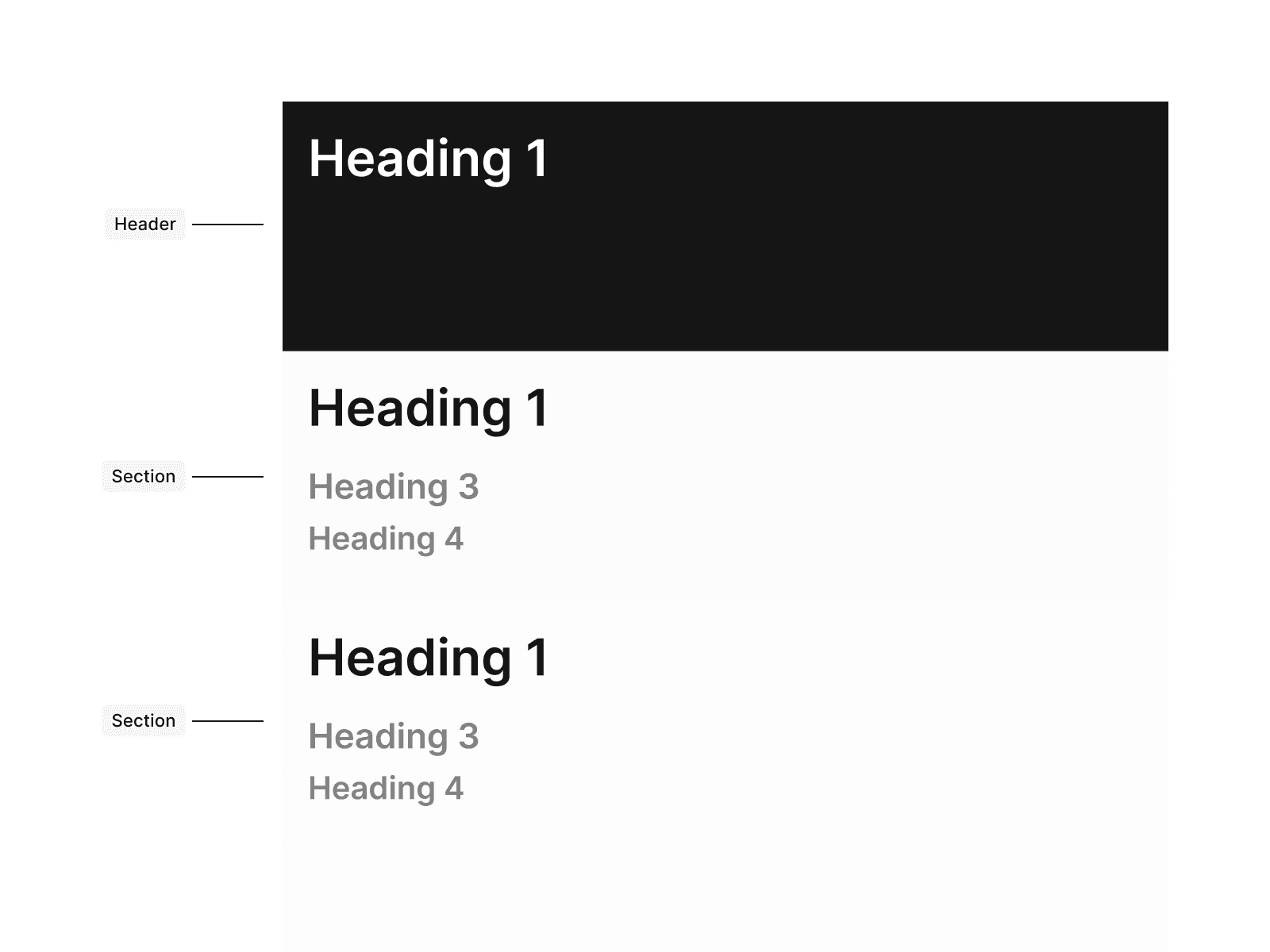
Don’t place more than one H1 on a page, as this breaks the HTML structure and negatively impacts SEO.
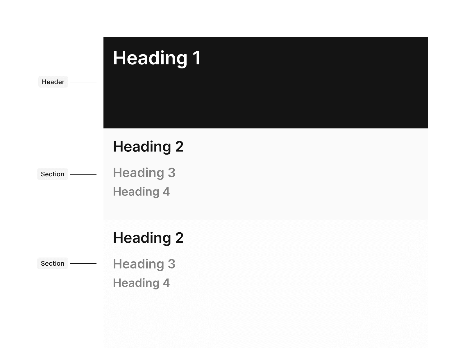
Do use only one H1 per page to ensure proper SEO and a clear content hierarchy.
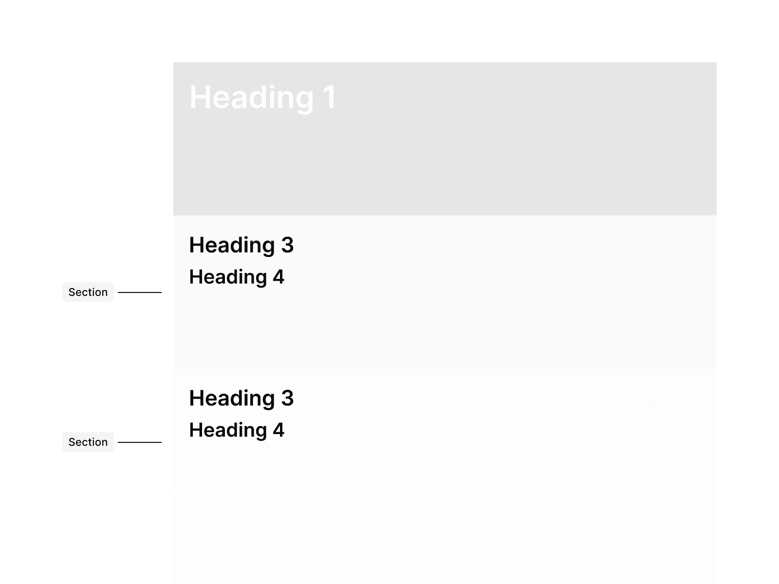
Don’t start a content section with any heading other than H2, since it disrupts the HTML structure and looks visually inconsistent.
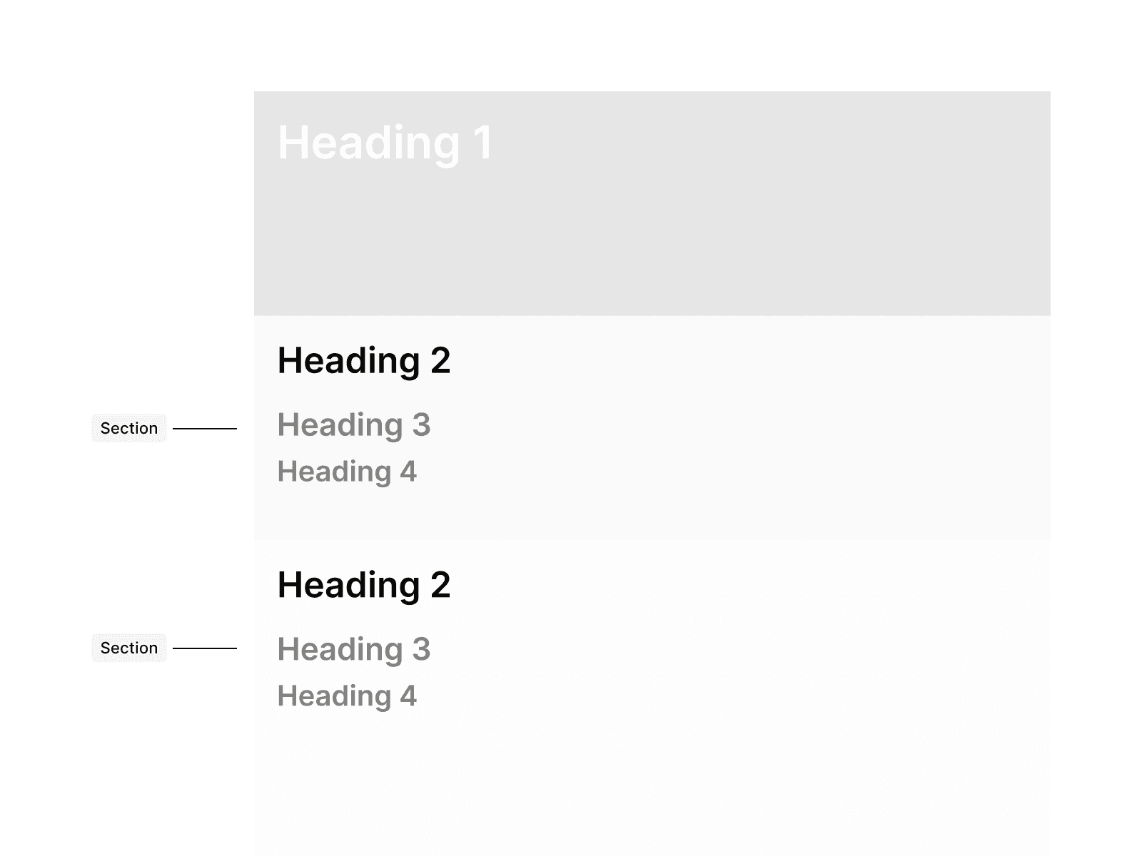
Do start content sections with H2 to maintain SEO benefits and ensure visual consistency.