Button
Content
Introduction
A button triggers an action or event and clearly communicates what will happen next. Buttons are designed to draw attention and guide interaction. They come in different variants and sizes to support a wide range of contexts.
Variants
Button variants provide different levels of emphasis to support a clear visual hierarchy. They help distinguish between primary actions, secondary tasks, and supportive navigation. Choosing the right variant ensures consistency and guides users toward the intended interaction.
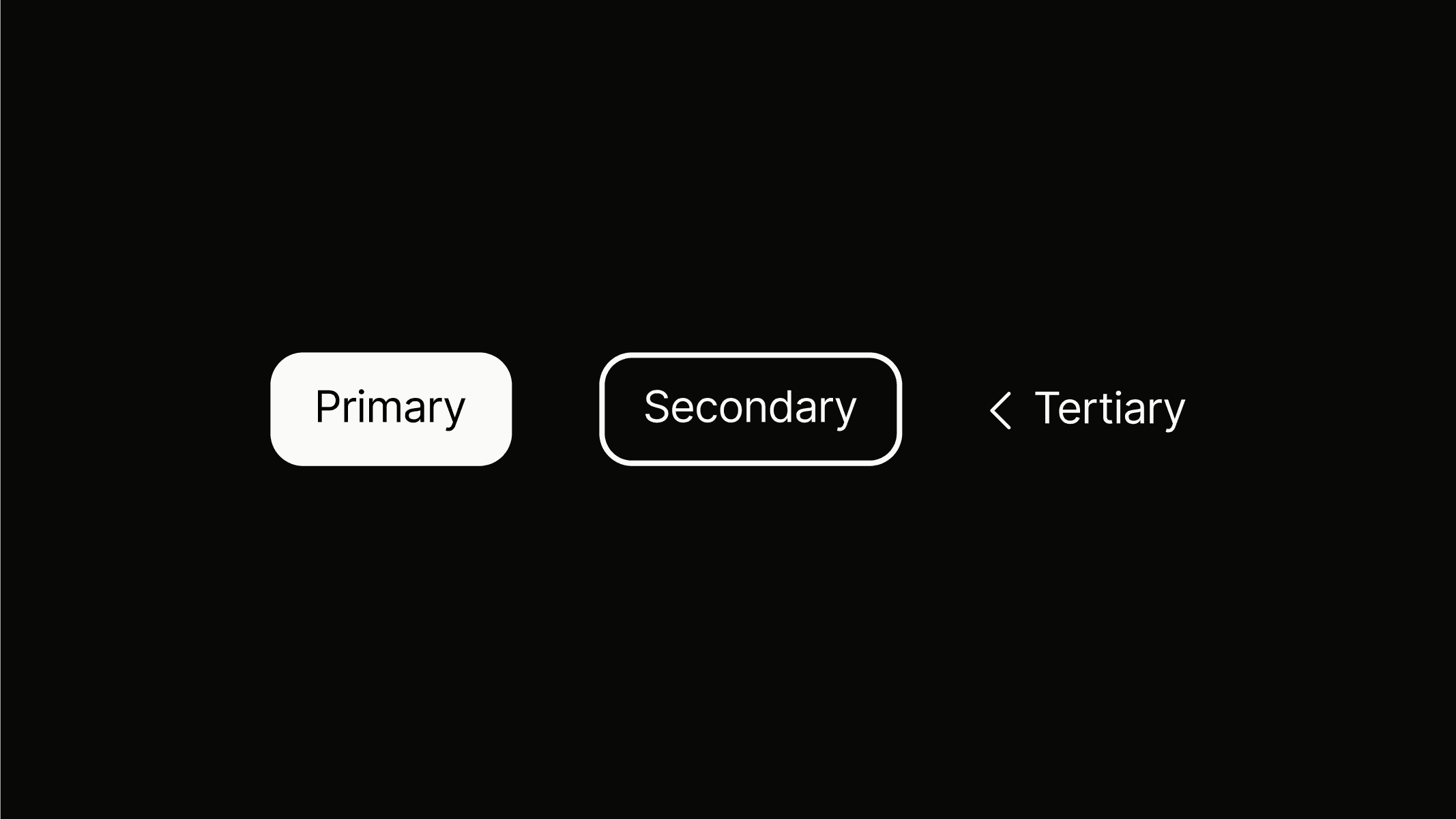
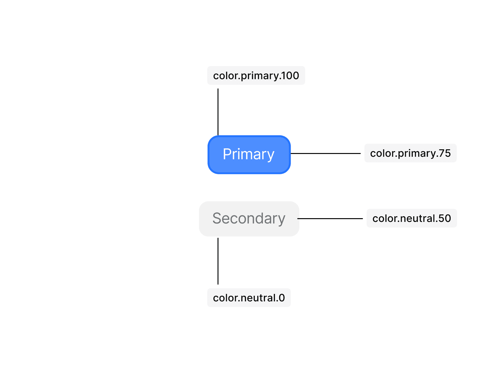
Primary
Use button.primary to highlight the most important action on a page, such as submitting a form. A primary button should only appear once within a given area, and not every screen requires one.
Secondary
Use button.secondary for less prominent actions, such as supporting tasks or secondary submissions. Secondary buttons can appear multiple times within a given area, and not every screen requires one.
Tertiary
button.tertiary is reserved for navigation within the platform and serves exclusively as a back button. It uses the browser’s native back function to return the user to the previous page.
Sizes
Button sizes adapt to different contexts and layouts. They ensure clarity and usability across various screen types and interface densities. Consistent sizing maintains hierarchy and makes actions easy to identify, whether on desktop or mobile.
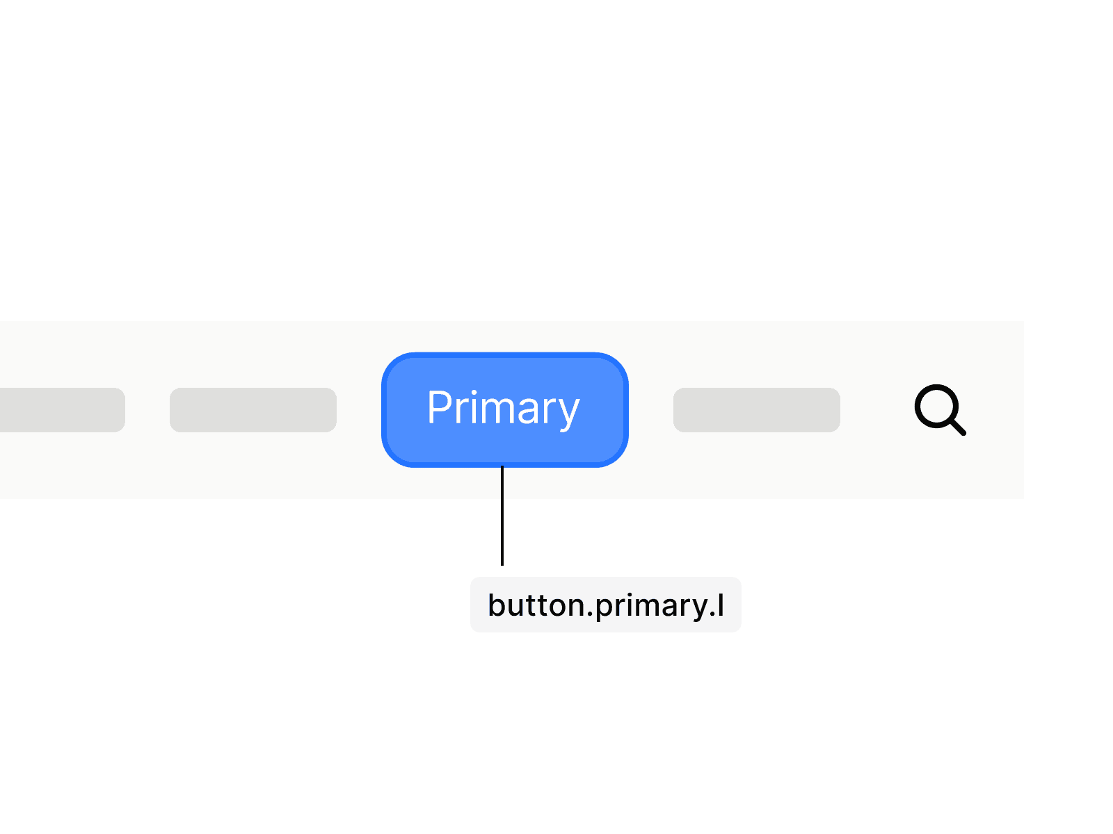
button.primary.l
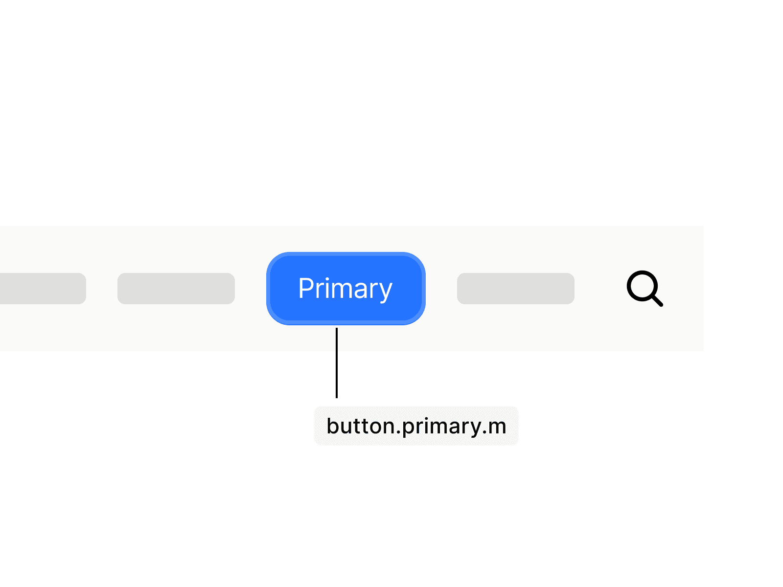
button.secondary.m
button.tertiary.s
button.primary.l
button.secondary.m
button.tertiary.s
States
Button states provide visual feedback to indicate interaction and system response. Common states include default, hover, active, focused, and disabled. Clear state changes improve usability, guide user behavior, and ensure accessibility.
Primary
The primary button changes its fill to the outline color on hover and focus. When focused via keyboard, an outline using primary.25 with a padding of spacing.3xs appears to emphasize focus. Disabled state shows primary.25 as background with no outline, indicating it is inactive.
Secondary
The secondary button changes its fill to the outline color on hover and focus. When focused via keyboard, an outline using neutral.50 with a padding of spacing.3xs appears to emphasize focus. Disabled buttons are displayed at 50% opacity, indicating they are inactive.
Anatomy
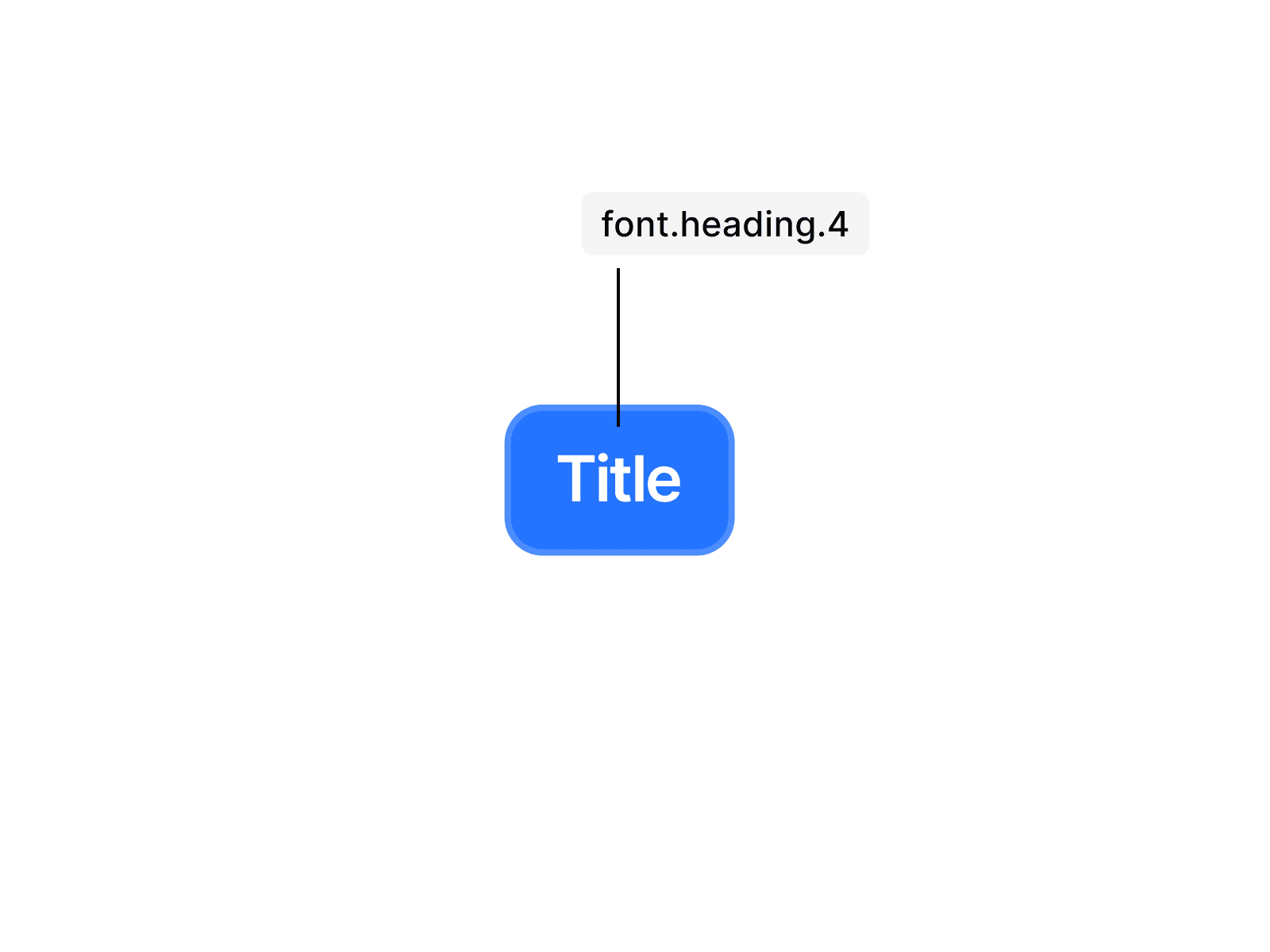
Primary and secondary buttons do not change in padding across sizes. The different sizes are achieved solely by adjusting the text token, resulting in smaller or larger typography while spacing remains consistent. The exact tokens and their applications can be seen in the illustrations.
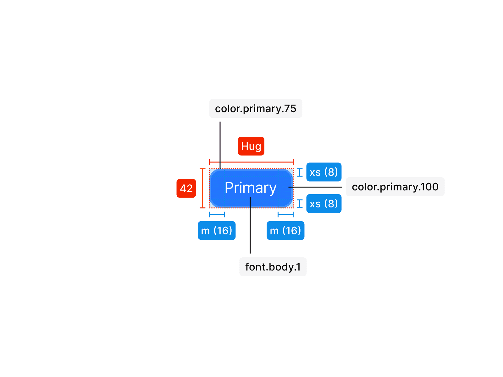
Primary L
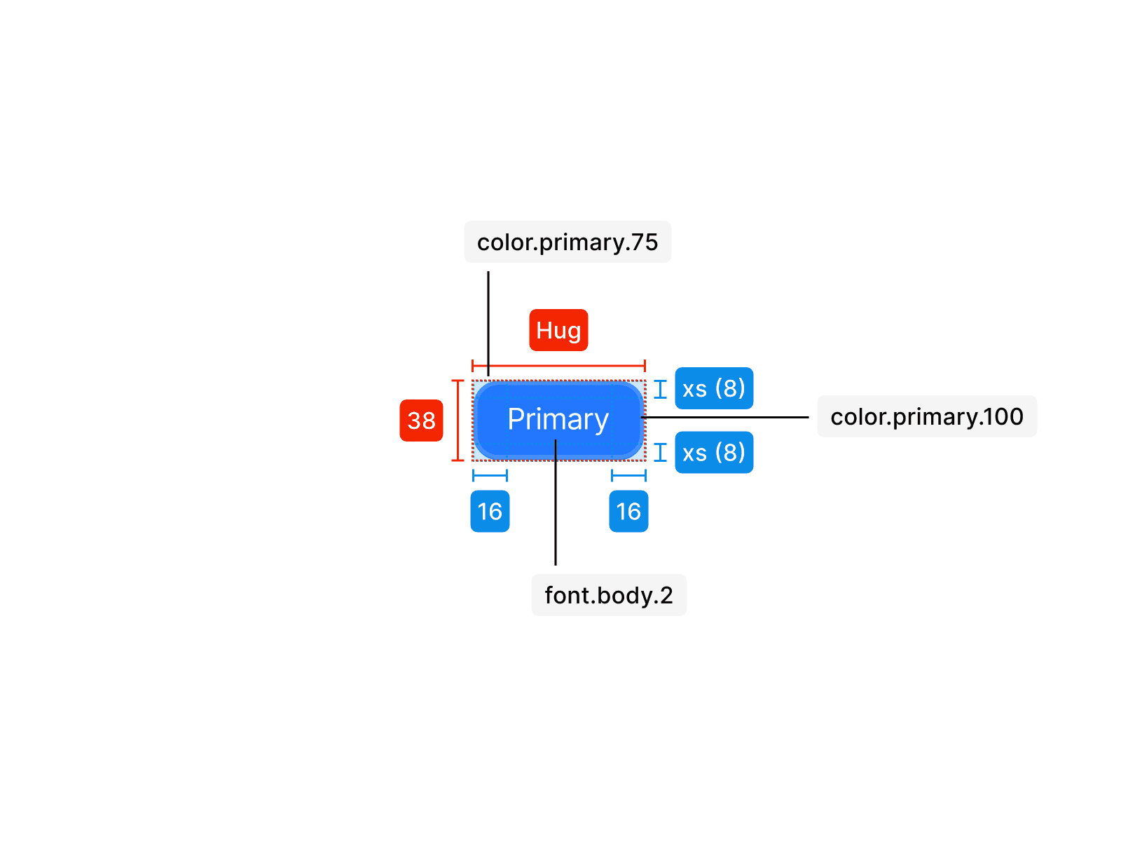
Primary M
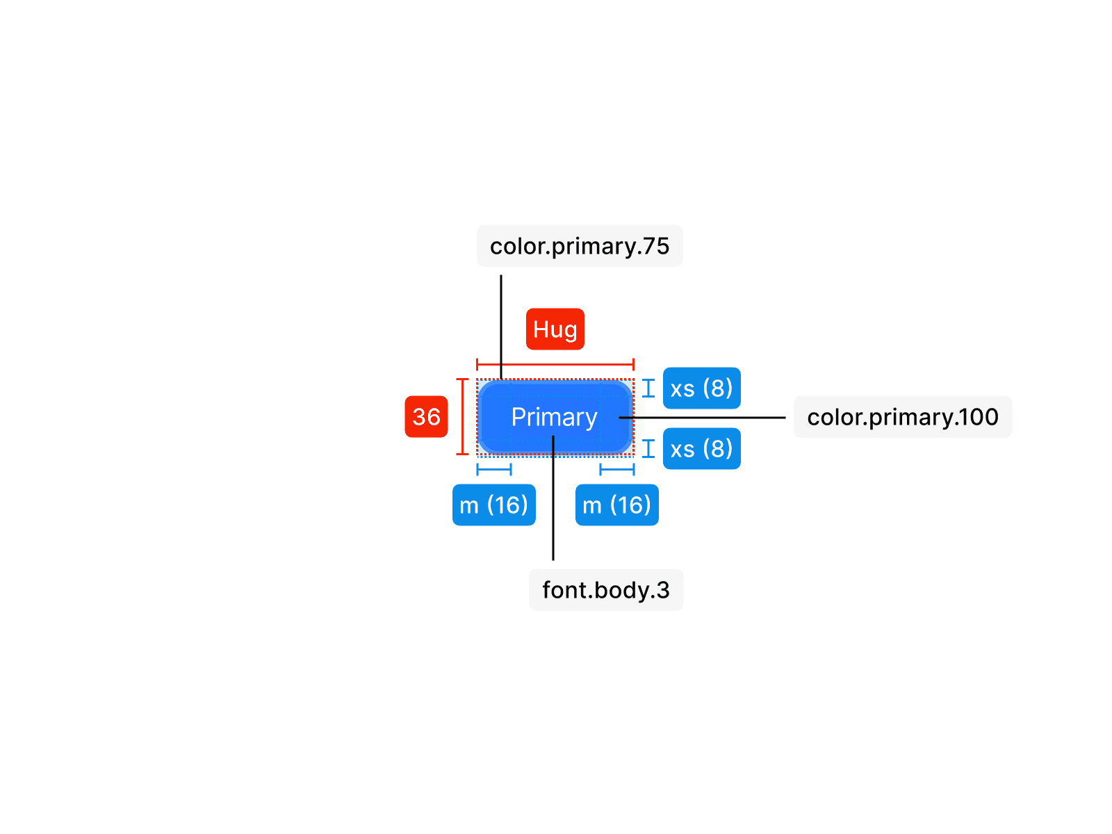
Primary S
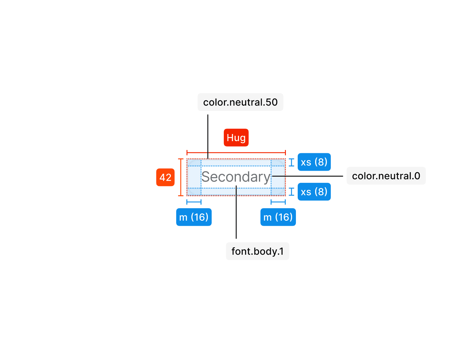
Secondary L
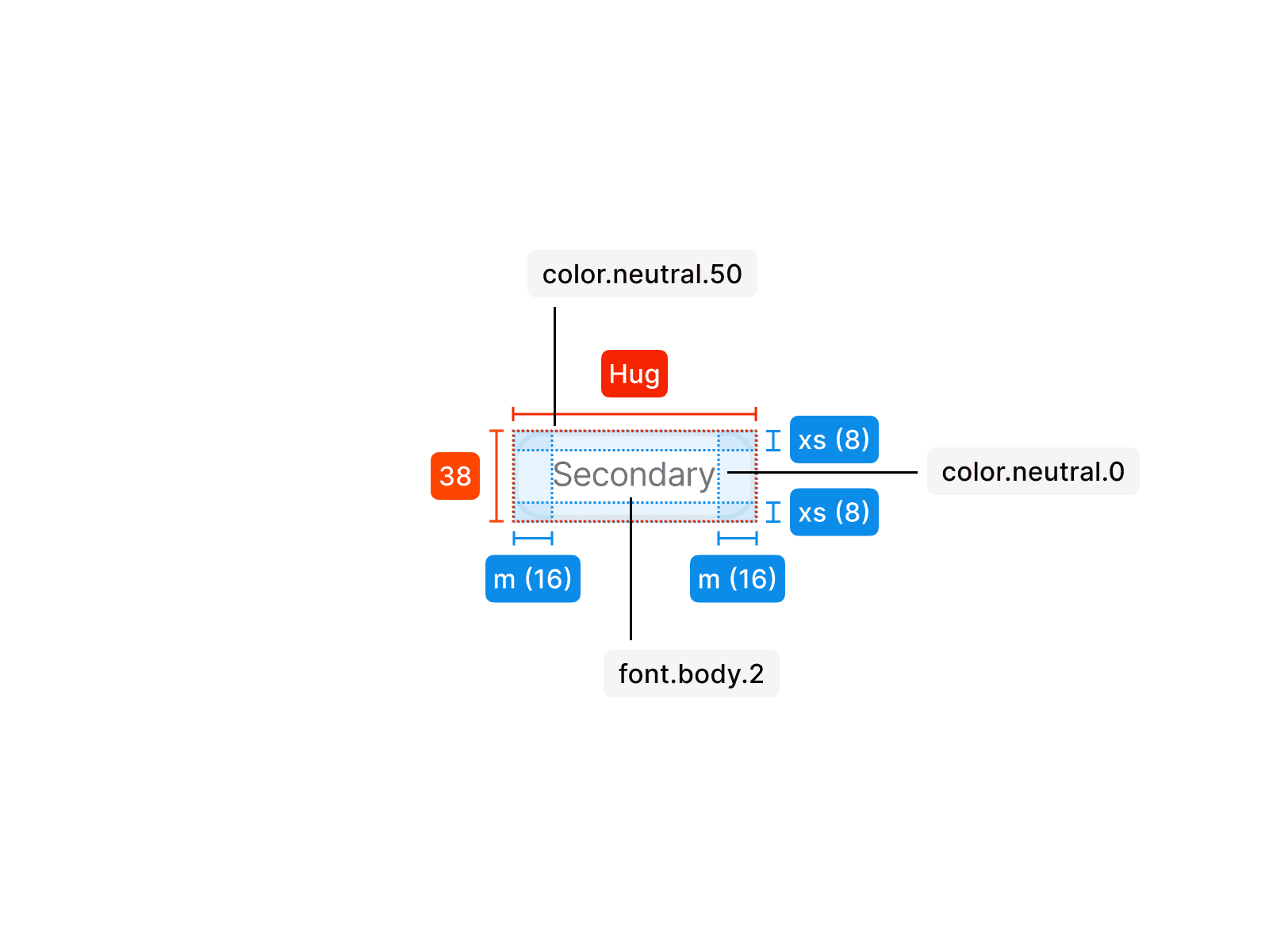
Secondary M
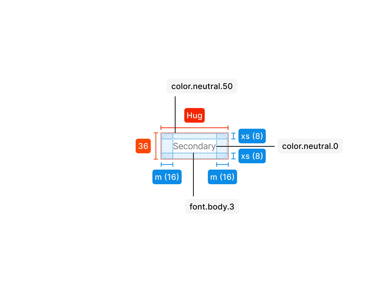
Secondary S
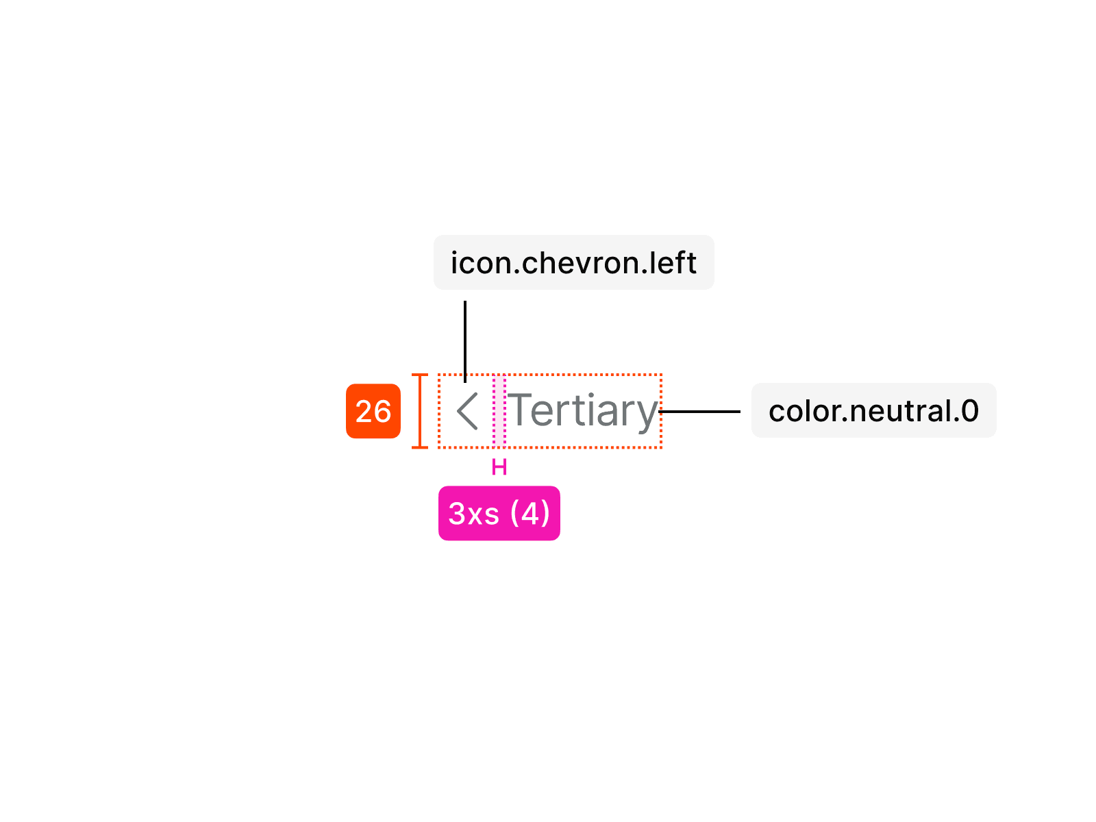
Tertiary
Usage
An tooltip is used in specific contexts and follows clear rules for consistent application. The examples below show how it should be applied correctly and what to avoid.
Don’t change typography in buttons. Different variants already come in different sizes, and typography adjustments break consistency.
Don’t switch colors of outline and fill. The predefined variants ensure both readability and interaction clarity and must not be altered.
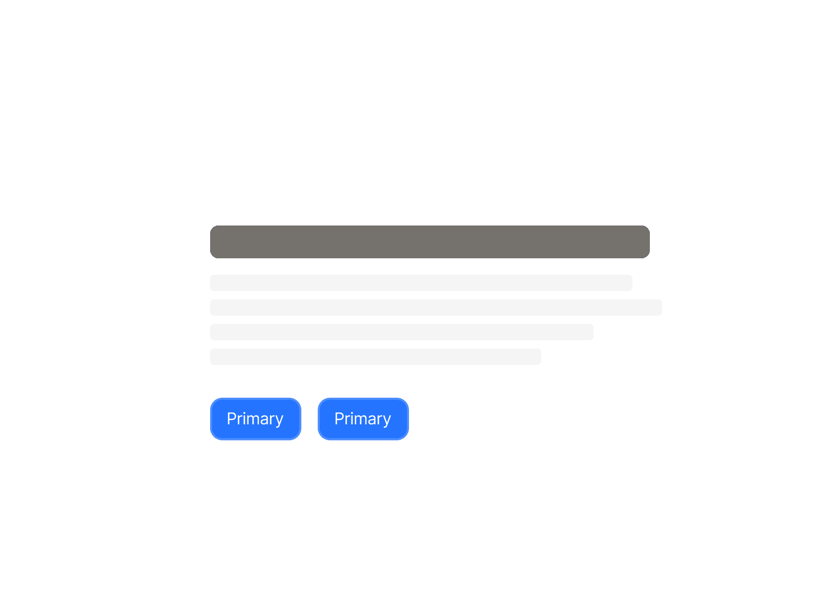
Don’t use multiple primary buttons within the same section. Only one per section or content area is allowed.
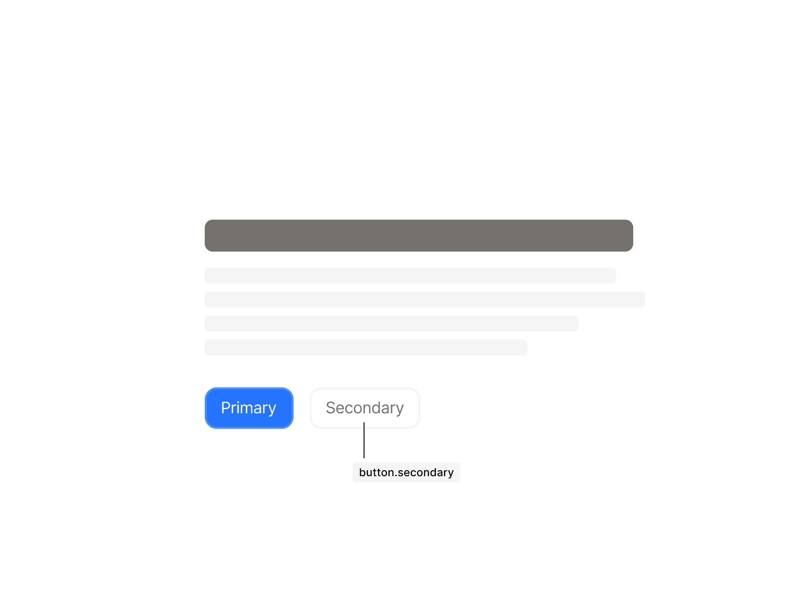
Use button.secondary when a secondary action is needed.
Do not deviate from the predefined variants when used within other components.
Always use the designated variants in elements where they have been specified.