Info card
Content
Introduction
A badge is a visual indicator used to display categories, use cases, or additional information, as well as numeric values such as discounts.
Variants
There are two badge variants: badge.pill for a highlighted appearance and badge.ghost for a more subtle look.

Title
Content
Lorem ipsum dolor sit amet, consetetur sadipscing elitr, sed diam nonumy eirmod tempor invidunt ut labore et dolore magna aliquyam erat, sed diam.
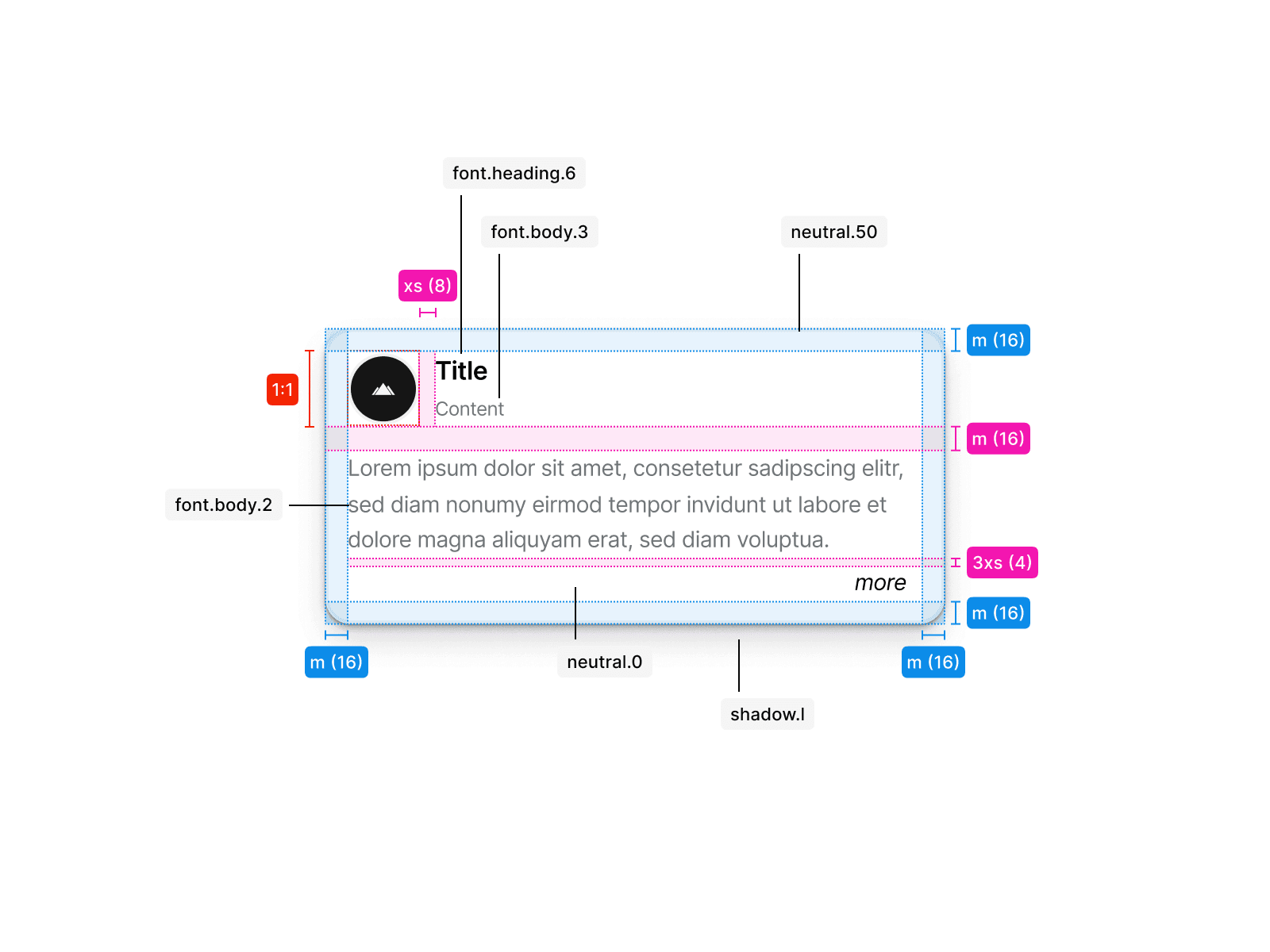
card.info.reduced
Reduced
Use button.primary to highlight the most important action on a page, such as submitting a form. A primary button should only appear once within a given area, and not every screen requires one.
Title
Title 2
Content
Lorem ipsum dolor sit amet, consetetur sadipscing elitr, sed diam nonumy eirmod tempor invidunt ut labore et dolore magna aliquyam erat, sed diam voluptua.
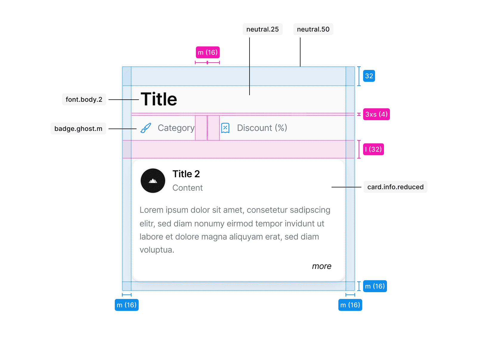
card.info.compact
Compact
Use button.secondary for less prominent actions, such as supporting tasks or secondary submissions. Secondary buttons can appear multiple times within a given area, and not every screen requires one.
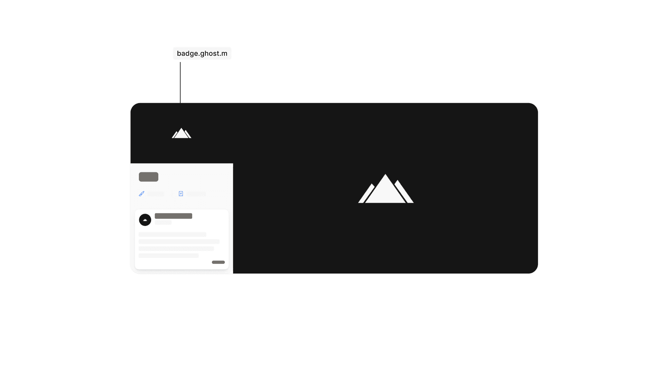
card.info.image.compact
Lorem ipsum dolor sit amet, consetetur sadipscing elitr, sed diam nonumy eirmod tempor invidunt ut labore et dolore magna aliquyam erat, sed diam.
Image compact
Badge.ghost consists of text and an icon only, without a background or outline. It is mainly used in layouts where space is limited, such as within card elements.
card.info.image.extended
Image extended
Badge.pill is a highlighted variant that can be used when there is enough space, for example on detail pages to display verification periods or discount types.
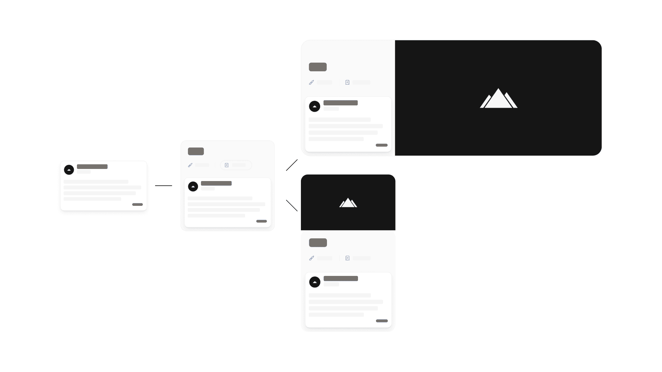
Anatomy
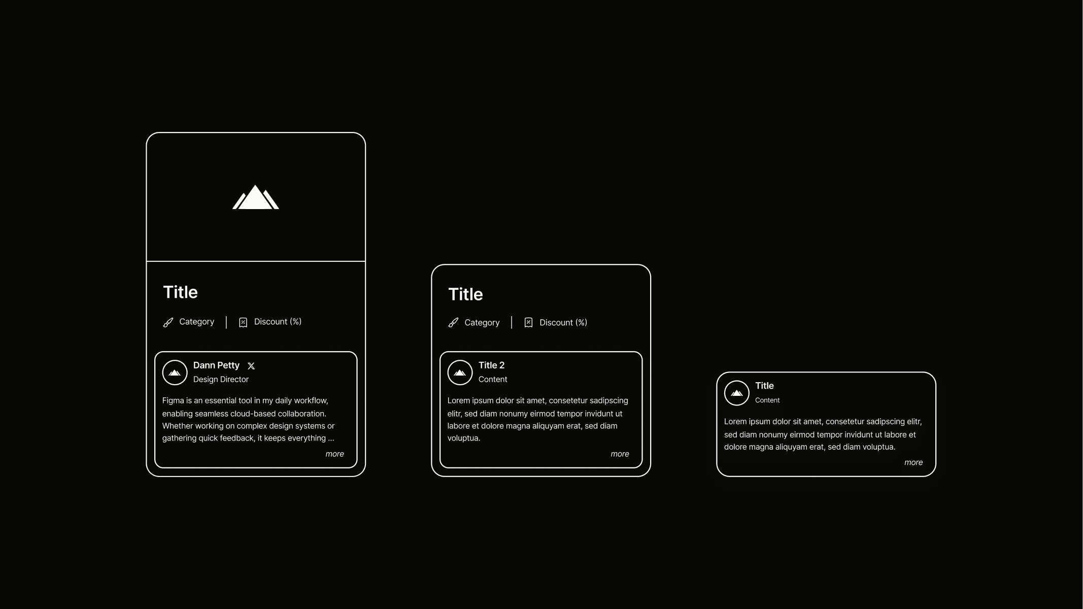
Info cards are structured to build upon each other as content increases. Card.info.compact is based on card.info.reduced, while card.info.image.compact adds an image to the layout. Card.info.image.extended displays this image in a horizontally enlarged format. Each variant builds on the previous one, complemented by additional padding, backgrounds, or outlines. The exact tokens and their applications can be seen in the illustration.
Reduced
Compact
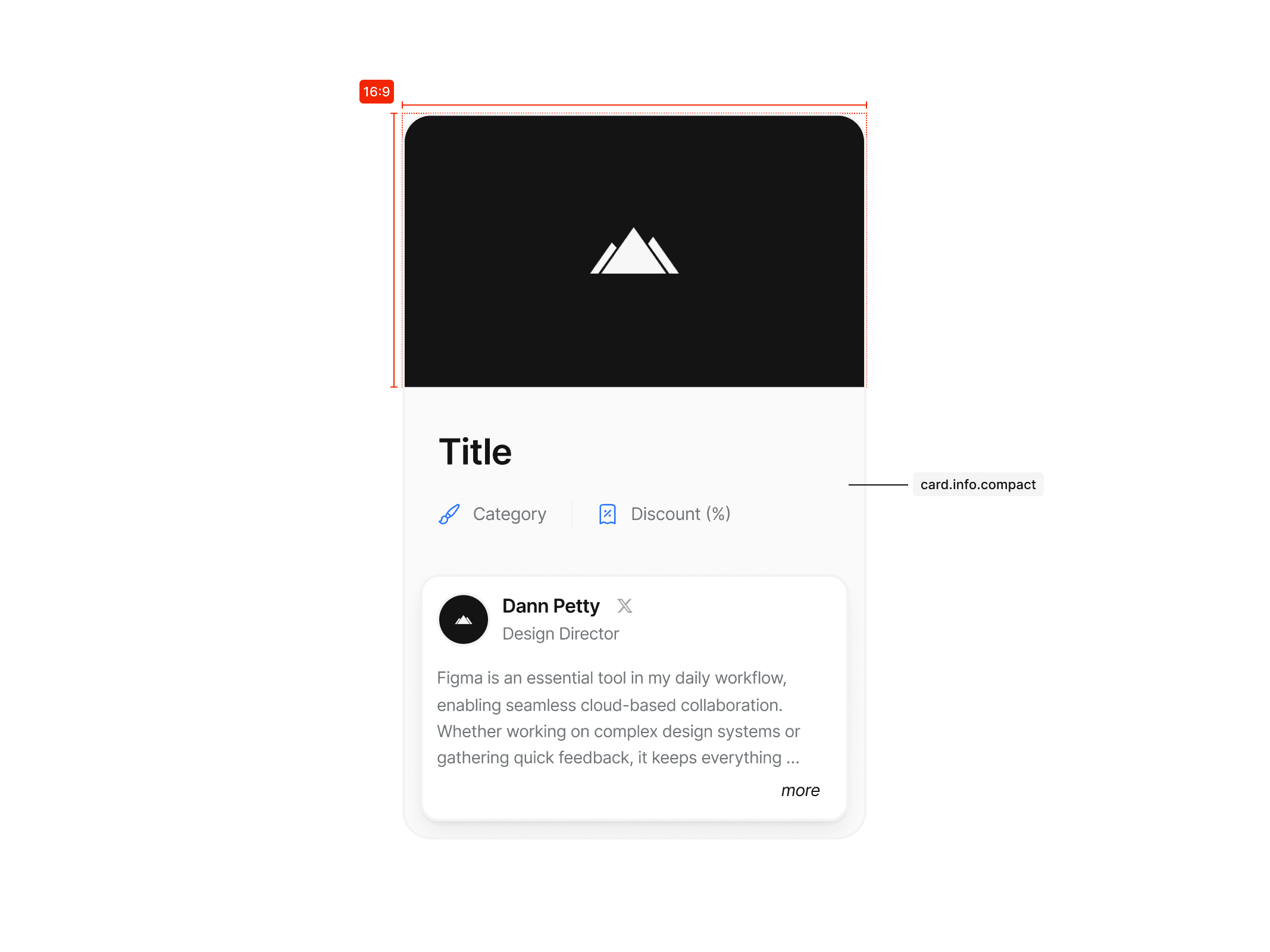
Image compact
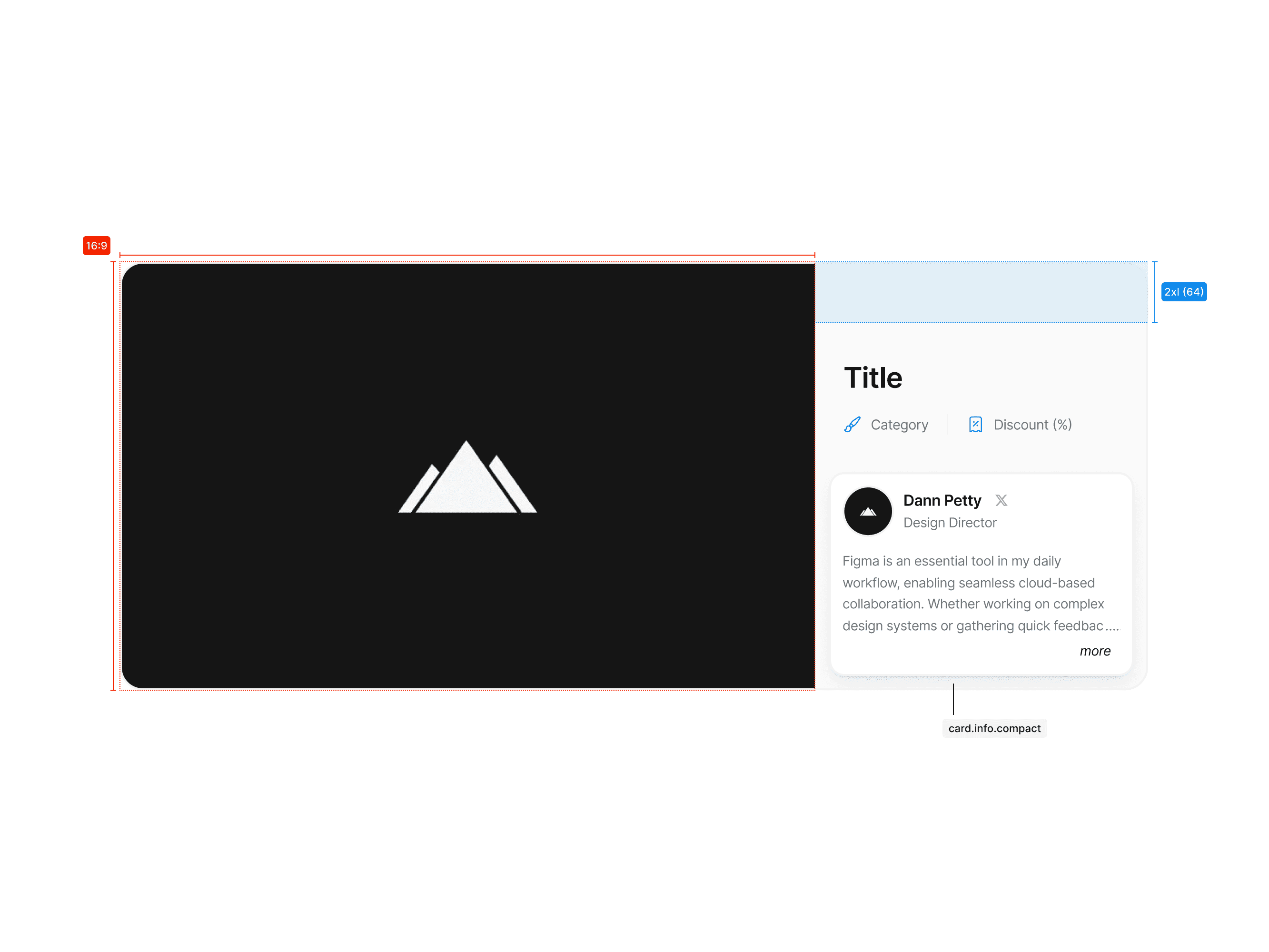
Image extended
Usage
The following examples show how the Student Perks logo should not be used.
Don’t disrupt the variant hierarchy. Only use predefined variants and avoid mixing them up.
Variants follow a clear hierarchy and build on each other. Use them as intended.