Tooltip
Content
Introduction
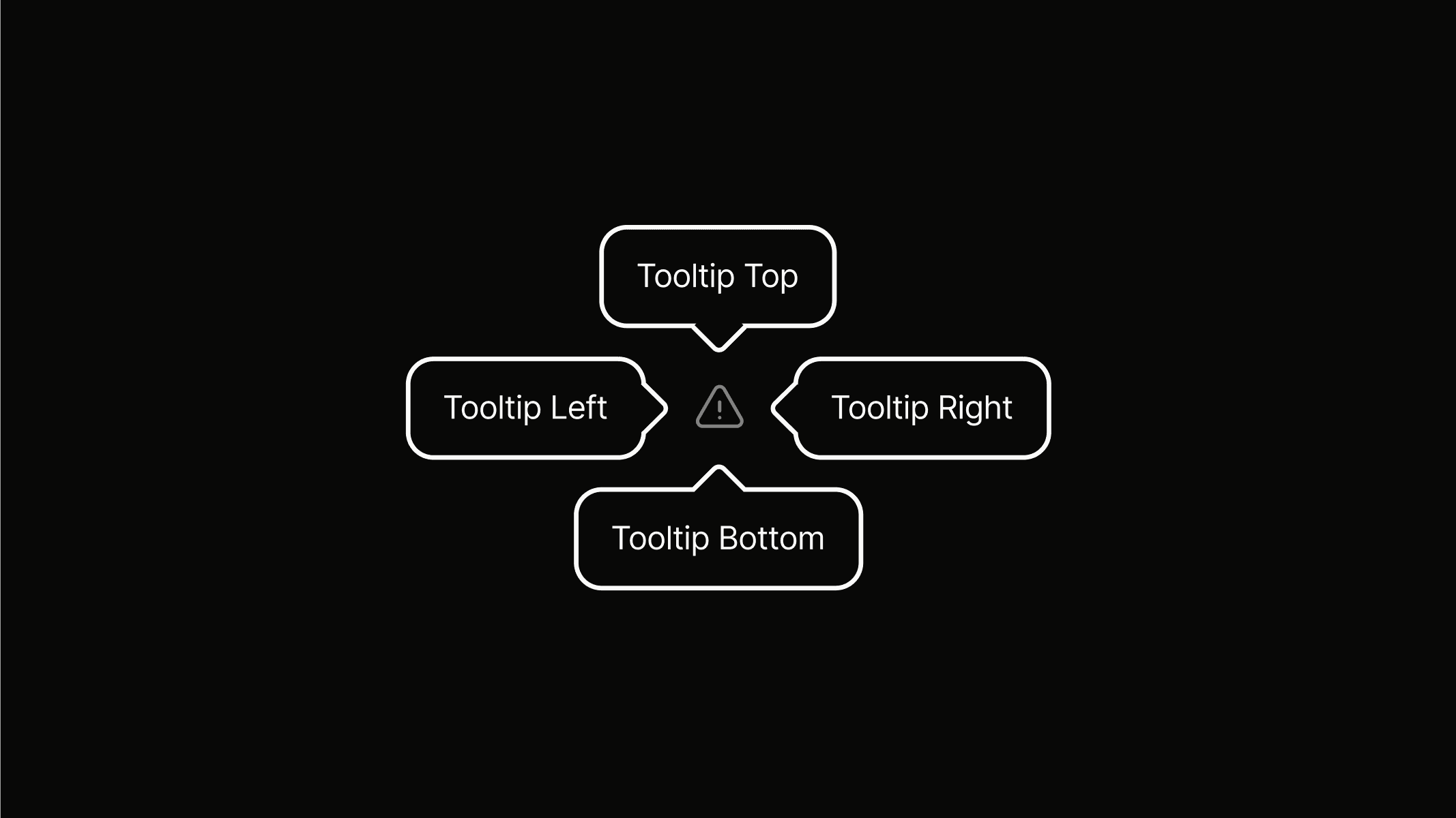
A tooltip is a floating, non-actionable label that provides additional information or explains a user interface element or feature.
Variants
Tooltips come in different variants to control their alignment and positioning relative to the element they describe.
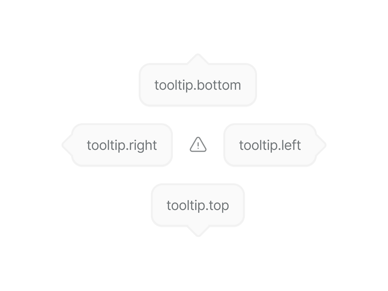
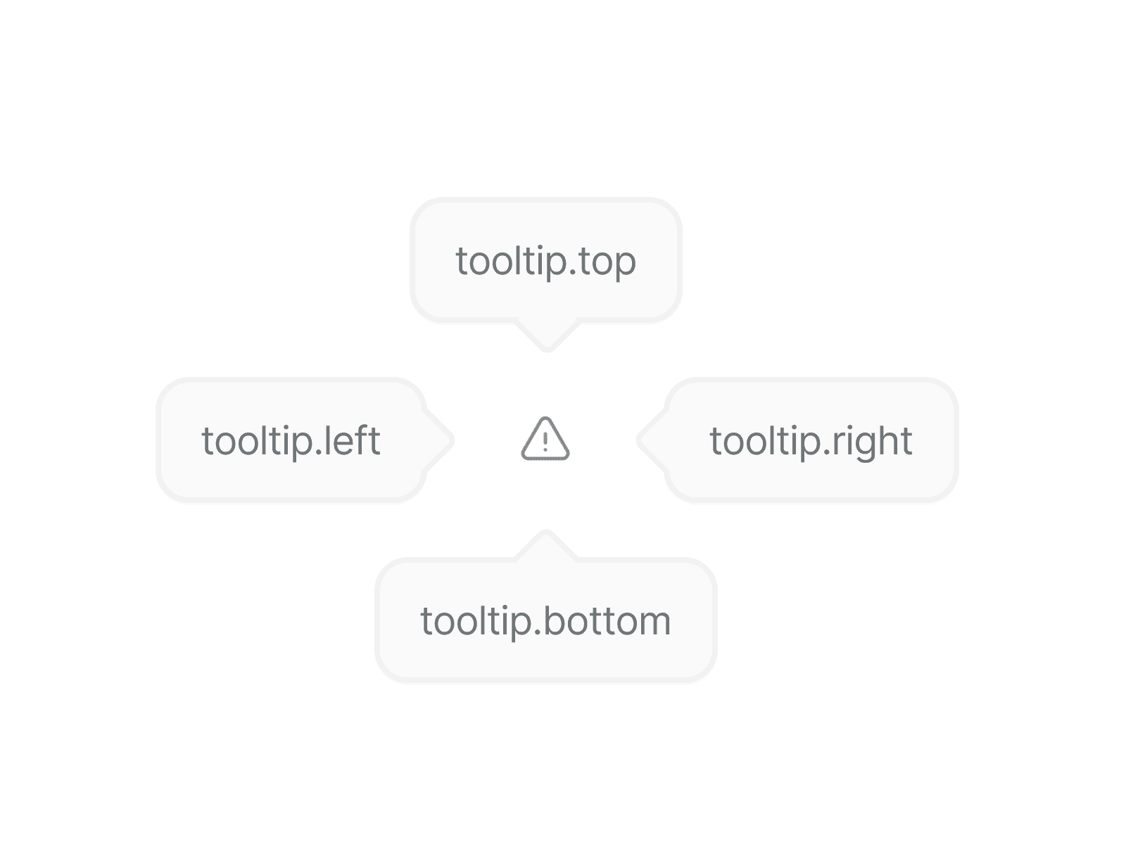
tooltip.bottom
Bottom
Used when the element is below the tooltip.
tooltip.top
Top
Used when the element is above the tooltip.
tooltip.right
Right
Used when the element is to the left of the tooltip.
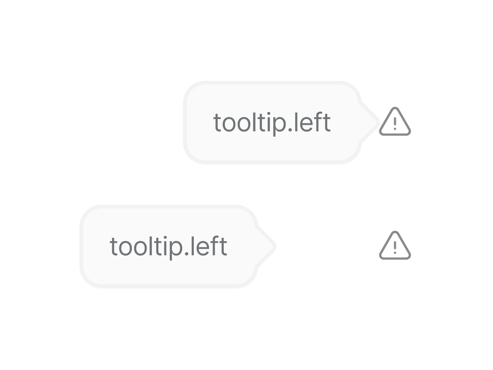
tooltip.left
Left
Used when the element is to the right of the tooltip.
Preview
Use the preview area to try out and interact with tooltip variants.
Anatomy
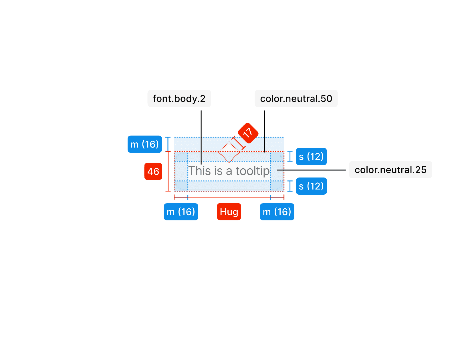
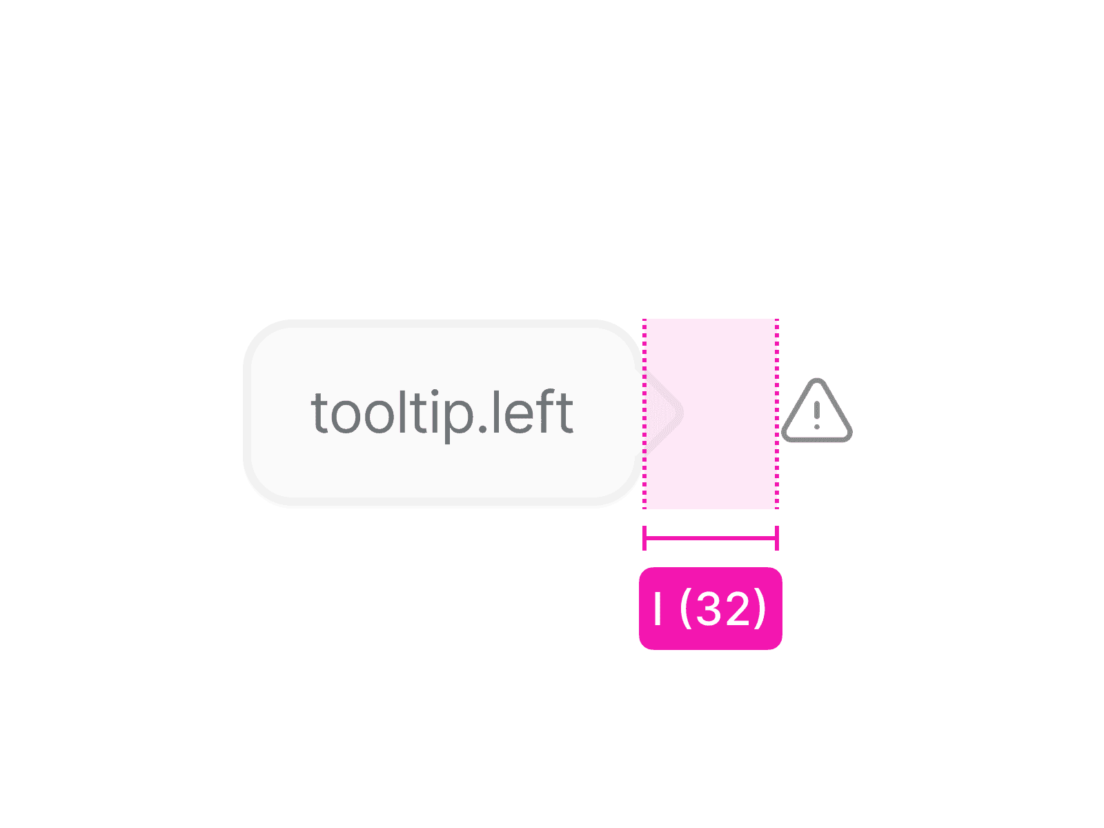
The tooltip stands out from the underlying content through the use of color.neutral.25 for the background and color.neutral.50 for the outline. An absolutely positioned div, rotated by 45 degrees, visualizes the direction of the emphasized element. With a width of 17 pixels, it ensures centered placement within the outline and can be positioned on all four sides. The exact tokens and their applications can be seen in the illustration.
Usage
An tooltip is used in specific contexts and follows clear rules for consistent application. The examples below show how it should be applied correctly and what to avoid.
Do not use incorrect variants; tooltips have specific versions for all four sides to ensure they appear correctly and function as intended.
Use the exact variant for all four sides of the element to ensure correct positioning and consistent behavior.
Keeping the layout to a maximum of four cards ensures the content remains easily scannable and visually balanced.
The tooltip should not be displayed too close or too far from the element. Use spacing.l to maintain consistent spacing across all four variants and all four sides of the element.
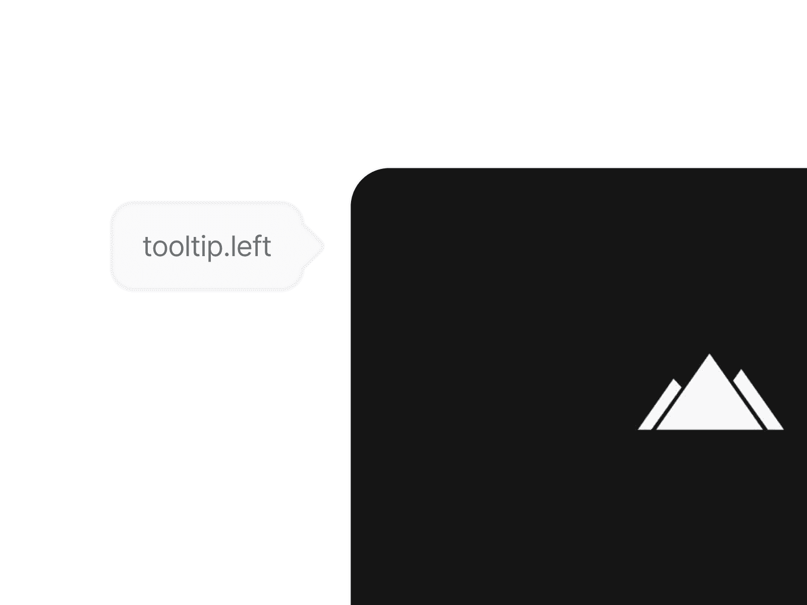
Only use tooltips on badges or icons; never apply them to other elements such as buttons, images, or text.